
From time to time an image will rise that speaks to me in a different way. Capturing images, in camera, with little need of editing after raw conversion, is always my goal. I create photographs by bringing all of my intention to an image that I hope will speak to the viewer in an engaging way. Having said that, I have discovered that creating composite images with textures or other photo layers can be a very satisfying process. One caveat: bad images with textures and other layers are still bad images. There is that old adage about putting a silk purse on a sow’s ear…
I posted images from the South of France just last week. Many people emailed or commented (on Facebook and this blog) with kind and generous remarks. Thank you! I’ve also been talking to several of the students that I mentor who have voiced an interest in working with textures and layers. I’m posting the step by step process here to encourage you all to have fun and give something new a try! As always, I send my gratitude to Jill and Paul and Flypaper Textures for their passion to make great products (click on the box there on the right and you’ll see all their marvelous sets of textures).
My disclaimer…I am not a photoshop instructor. There are many people who excel at this part of teaching, but I am not one of them. My intent here is to share something fun that might intrigue you.
The process:
After I have optimized my image in Lightroom 5 I will choose Photo~Edit In~Photoshop CS6 (or 4 or 5…whatever you are working in).
If I have opened my texture(s) file(s) from another source I will have a number of images open in Photoshop. For the purposes of this tutorial, lets go with the assumption that I have opened from another source rather than the plug-in (see note at end of post).
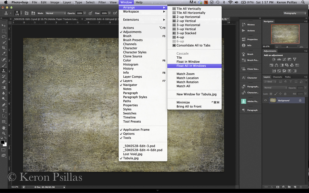
If your images are all in the same bar and you want them to appear in separate windows (you do) then click on Window ~ Arrange ~ Float all in windows.
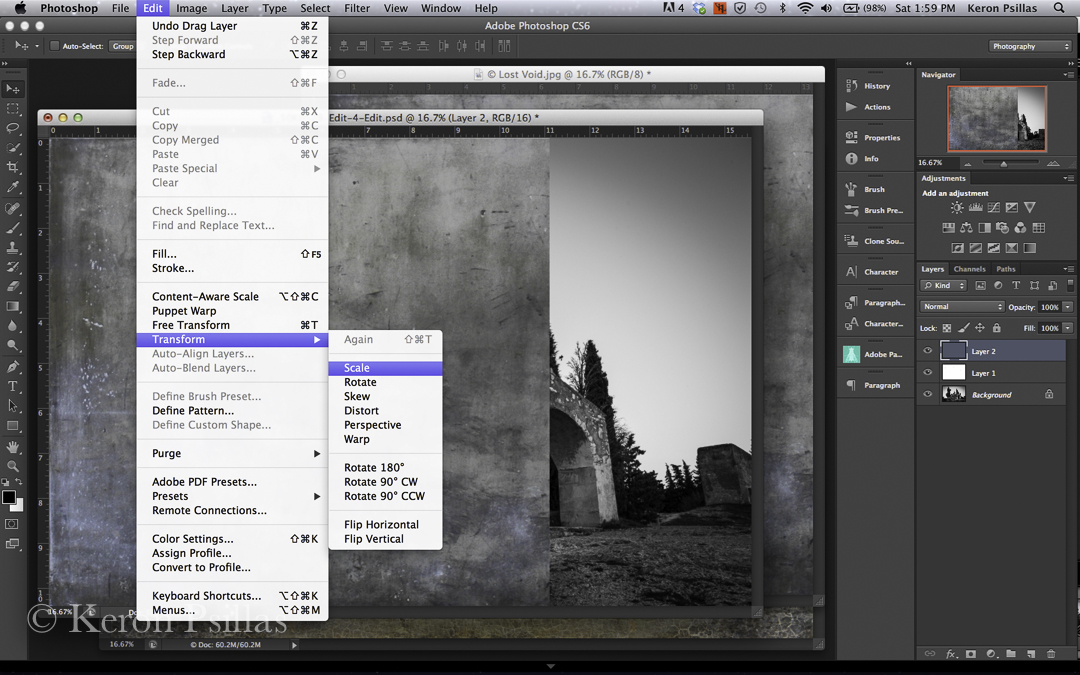
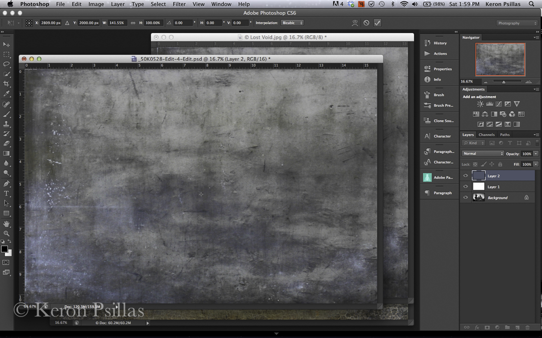
Now you can move your images onto each other. Click your move tool (at the top of your tool bar on right) and choose a texture to place onto an image. After you have moved it onto your image you will see that you have two layers. Perhaps your new texture layer is a different size than your image. Don’t worry. With your texture layer highlighted, choose Edit ~ Transform ~ Scale. Hold down your shift key and then resize by dragging a corner or side box to maintain your ratio. If you don’t need to maintain a ratio, simply grab one of the size boxes with your move tool and resize your texture layer to cover your image.
After you have resized your image, click the CHECK MARK on the upper right to confirm your resizing.
Now in your layers palette you need to choose the Blending Mode. The default is Normal. Click the drop down menu and you will see many options. I generally start with Soft Light or Overlay, depending on how I want the image to appear. Try each the options in the drop down menu and go back and forth to begin to learn the subtleties.
Perhaps you like the Overlay mode but it’s a little too strong? Move the opacity slider (just to right of Blending mode drop down box) left and fight to find the desired effect.
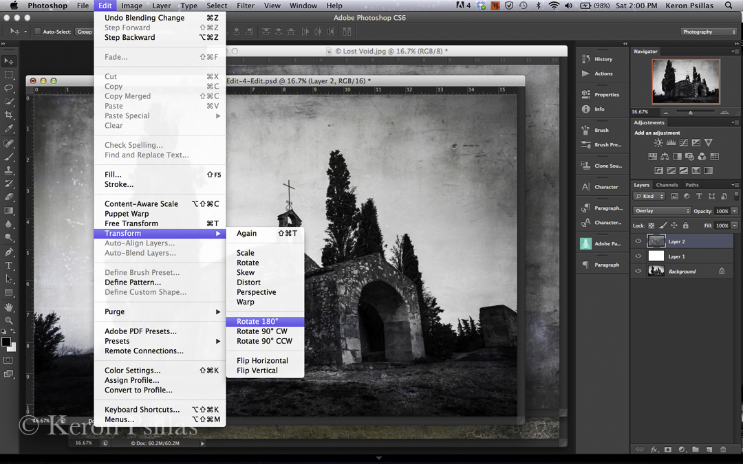
In this image I liked the effect but I knew that I wanted the bottom of the textured image to be on the top of my photograph. No problem. So I went back to Edit ~ Transform ~ Rotate 180. (make sure your texture layer is highlighted in your layer palette when you do this or your entire image will rotate!)
Perhaps you like the effect on some of the image but want to minimize it in certain areas? I use this a lot to block out the texture layer on faces, bodies of horses, or where the shadows and vignetting can be a little too strong. Go down to your bar at the bottom of your layers box (on right) and choose the mask overlay. It is the rectangle with the circle in the middle. This is where it gets really fun! Now you can ‘paint’ IN or OUT the desired effect. You have infinite control here simply by choosing the OPACITY of your BRUSH.
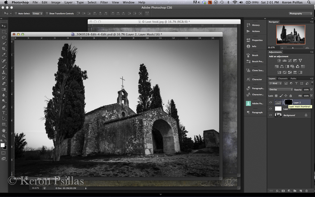
Next, click Command~I (with your texture layer highlighted) to completely block out your texture layer. You will see your mask turn completely black and you will see only your original image in the window. Now we can begin to reveal the texture layer WHERE we want it and in WHAT STRENGTH we want it.
Choose your brush tool from your toolbox. I generally start with 30% opacity on a fairly large, soft brush. (on the left in the tool panel) For finer detail work you will want a smaller, harder (less diffuse) brush. But start with a big soft brush. Here’s a key concept: BLACK BLOCKS, WHITE REVEALS. So down at the bottom of the tool panel on the left I will make sure I am painting with a WHITE brush IN MY MASK to reveal the texture layer (make sure the mask box is highlighted before you start painting).
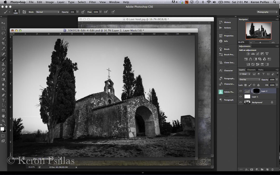
You can work either way, Paint ONTO your image with a white brush to REVEAL your changes, or paint OUT OF your image with a black brush to BLOCK the texture. I generally REVEAL the texture, slowly building up the effect.
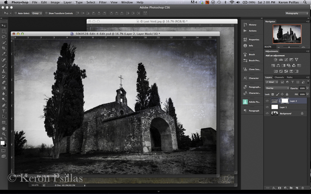
You can see by my layer mask in this screen shot that I have revealed ALL of the texture (100 percent) in the image except over the church and some of the tree. In the mask, the area that is black has BLOCKED the texture from showing through.
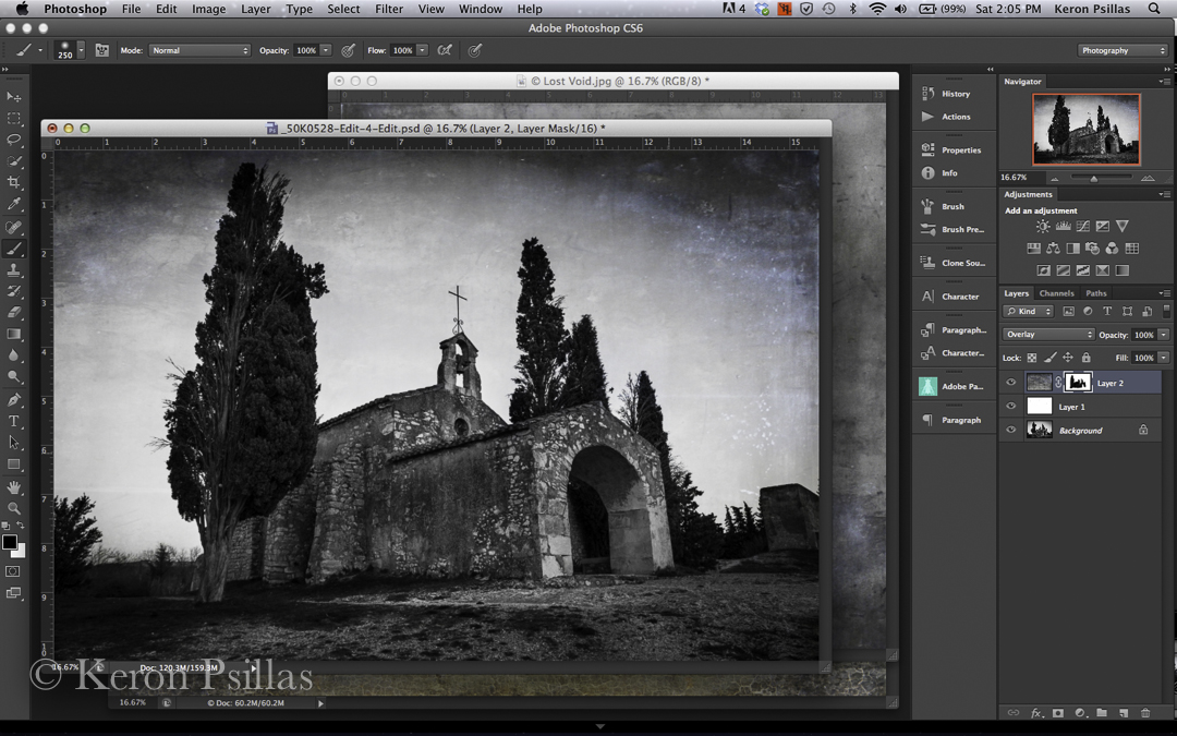
At this point I like the image but I’m not in love with it. I decided the effect needed more intensity. So I grabbed my texture layer and DUPLICATED IT…just to see what effect it would have. You do this by grabbing your layer and dragging it down to the little folder icon with the flipped up corner at the bottom of your layers palette on the right. (as with all icons, if you hover over it with your cursor it will ‘tell you’ what it is.)
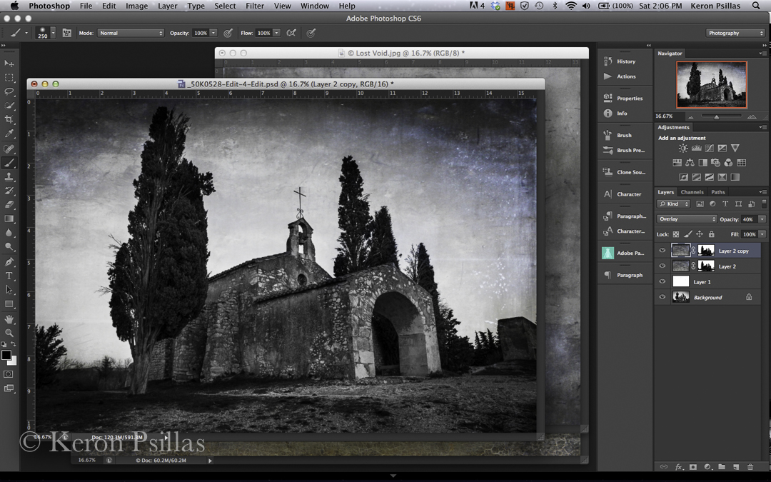
Now I have duplicated that texture layer, which compounded the effect of the texture. When I duplicated the layer it also duplicated my mask. You can make changes here simply by highlighting the mask (clicking on it) and then using your brush to reveal more or block more of the effect. Remember you can lessen or intensify the effect of your brush by choosing your brush opacity. Or you can remove the duplicated mask altogether by clicking on it and dragging it to the trash can in the lower right corner.
I like the more intense effect, but I want more depth in the sky, more of an aged feel. So I chose TABULA in my textures to layer on top.
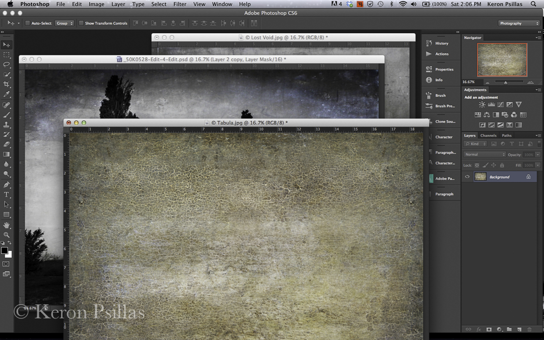
I resized the texture layer (outlined above), clicked the checkmark, and then after looking at it for a moment, I dialed the opacity of the texture layer back to my desired effect. Compare the next two images.
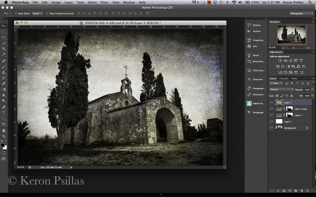
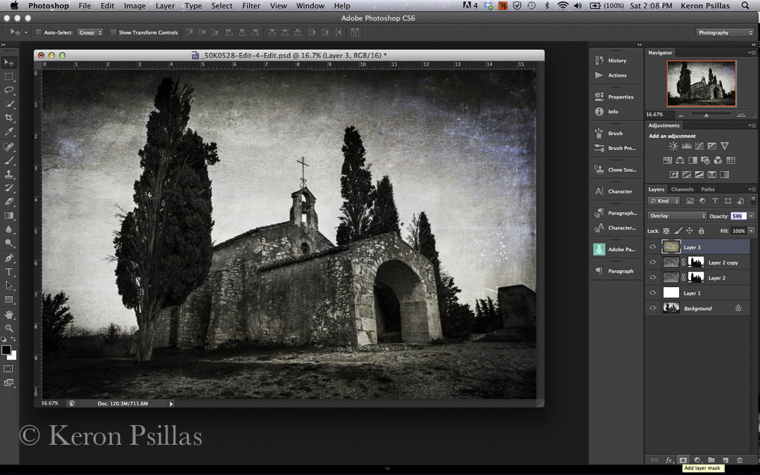
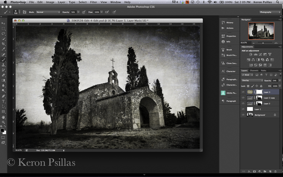
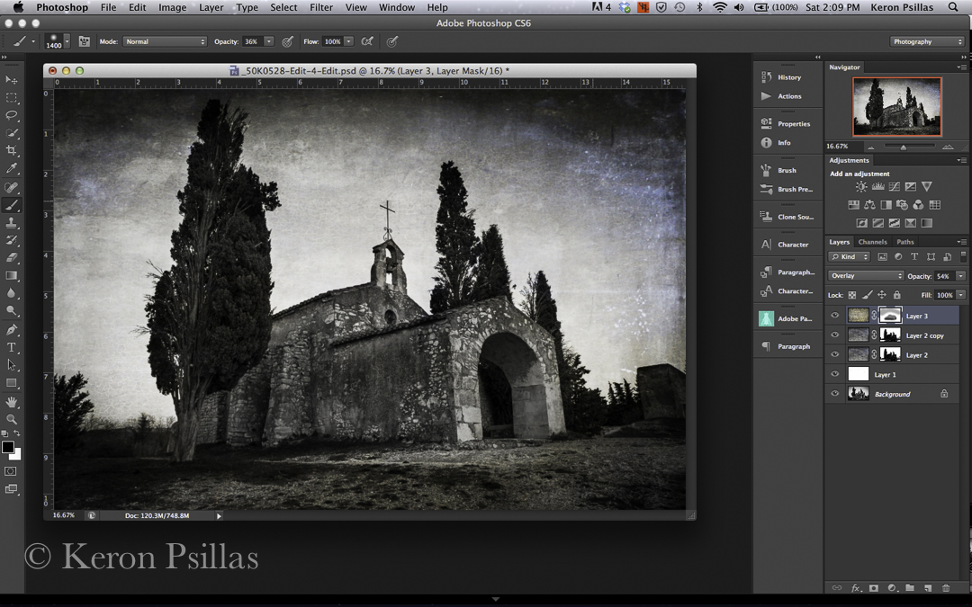
Notice the difference in the image itself. This is what I wanted, but I needed to fine tune some areas in the image. So I added my Layer Mask, and started to paint again with a black brush this time to BLOCK the effect. I was careful to dial back my brush opacity so I could work slowly….feel my way into how the image wanted to be. See the next two images. The first image shows my BLACK BRUSH at 56% opacity. The second image shows my BLACK BRUSH at 36% opacity. Sometimes you have to go back and forth between white and black brushes, painting in then painting out changes. Sometimes you have to throw away your layer mask and begin again!
I simply wanted to soften the effect in the sky and already dark corners, and really soften the effect on the stone itself. I chose TABULA because I wanted to echo the texture of the old stone. I didn’t need to add too much of the texture (just looking for the tone/color) to the stone. Then I walked away from the image! This is an important step. We can become emotionally attached to an image and a little bit ‘in-love’ with what we are doing. We need perspective, we need to cool our ardor a bit and then return to the image to check our work.
I finished with the image below…you can see a tiny difference in the layer mask on TABULA. I let a little more of the texture come through on the stone. It added more of the tone and color I wanted.
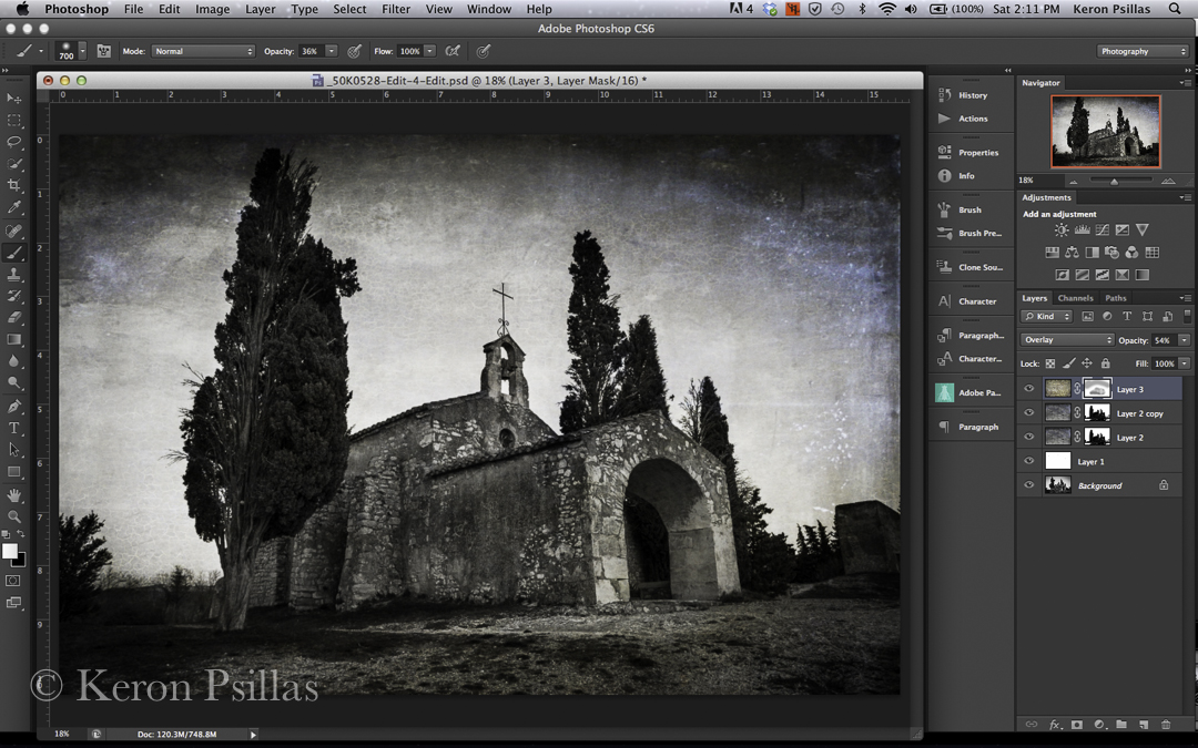
In this image of the Chapelle Saint Sixte near Eygalieres (Provence) France I knew when I was making the image that I wanted a more somber, mysterious mood for the photograph. The more you work with textures the easier it will become to feel your way into what the image needs. But I began with an intent. I photographed with the intent to transform the image and I carried that intent all the way through the processing.
I hope you have enjoyed this tutorial. I’ll be teaching this in my upcoming workshops (both the equine photography workshops in California and New Jersey in May as well as my workshop with the Pacific Northwest Art School on Whidbey Island in August). And to continue the self promotion, I do mentor a limited number of students each year. We have a blast and learn a lot. Zip me an email if you are interested in any of these opportunities. ( keron AT keronpsillas.com ) And if you like this post, leave a comment or share with a friend! I would truly appreciate it. Happy Shooting! ~Keron
PS…if you want more information on texturing, click on the Flypaper Textures box there on the right hand side of my blog and see what Jill and Paul are up to! There’s a wealth of information on their site and blog. And if you are interested in having a plug-in that will keep your favorite textures handy, visit Dr. Russell Brown’s site for a free one AND some great FREE Flypaper Textures. Click on THIS LINK to download your own plug-in. It’s easy and a great timesaver. Be aware though, it only works with CS6. Just scroll down to find the Green T for the textures script on his page. Have fun!
Recent Comments